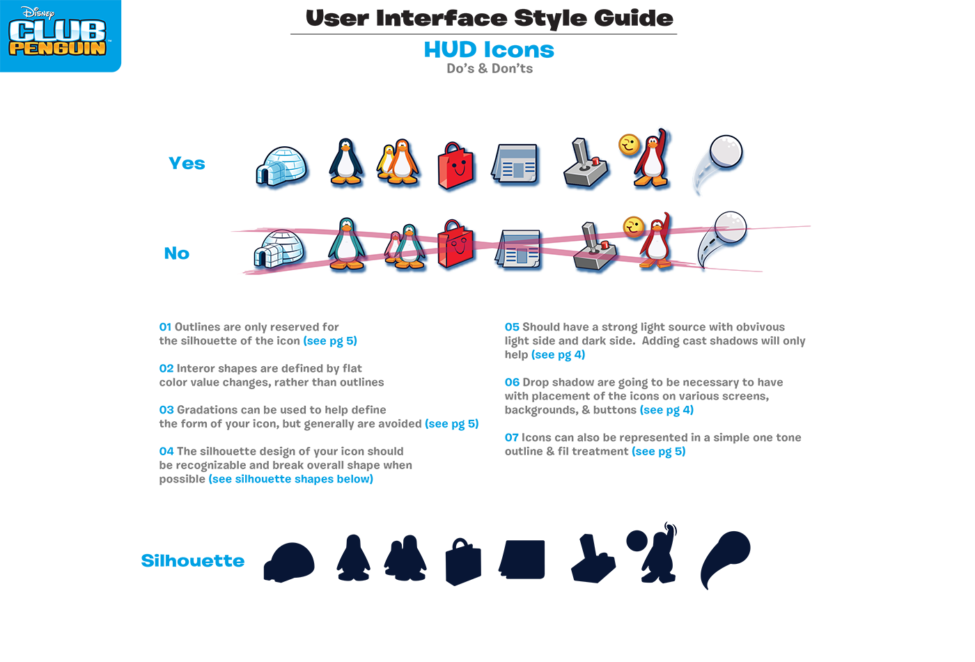
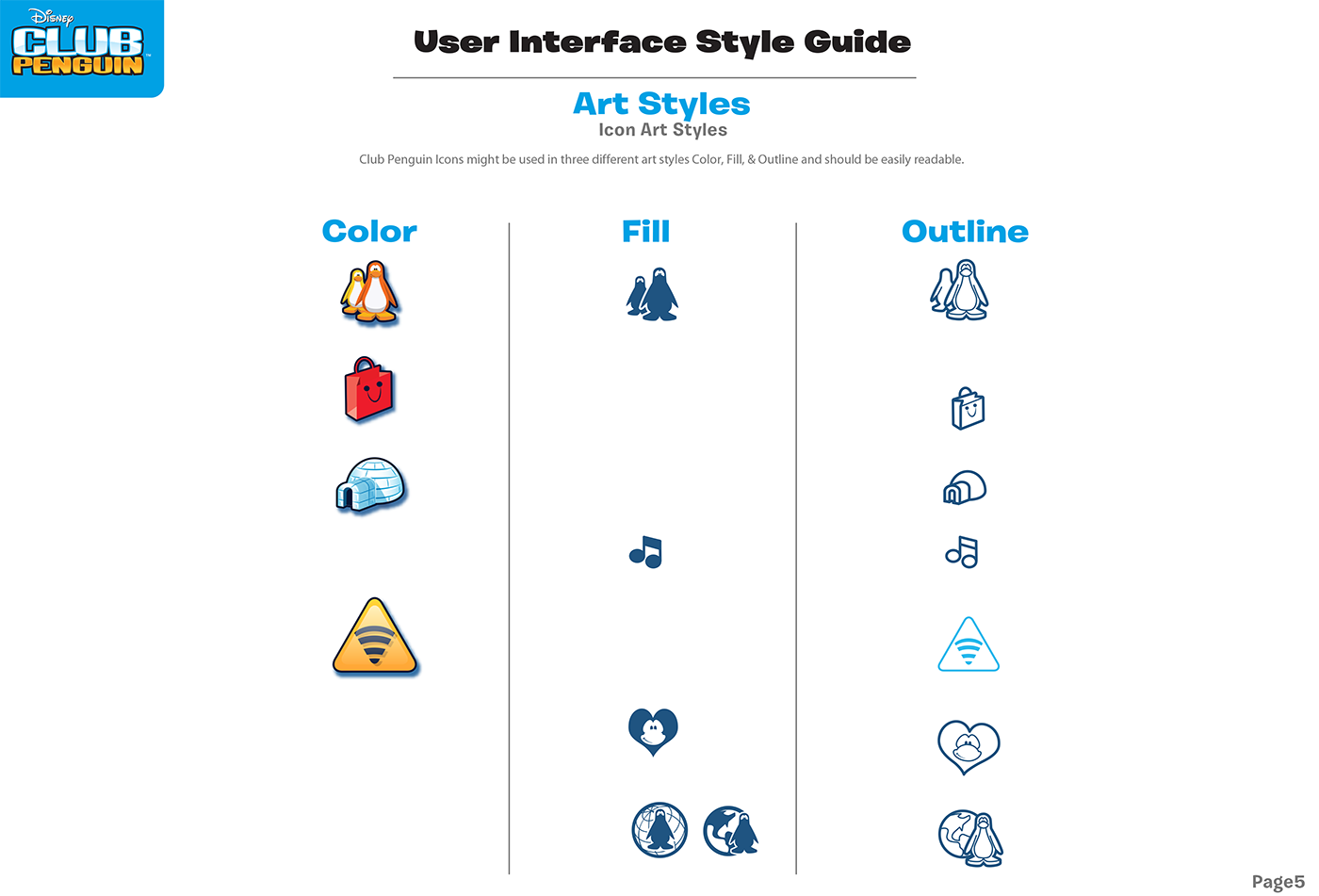
As we were converting all the old artwork created for the web over to mobile, this was my opportunity to create a brand UI guidelines for my new UI interface. Here is a do's and don't page. With my background in illustration and concept art many character designers use silhouettes to build a strong design. I was able to use this process in creating strong UI and icon designs.
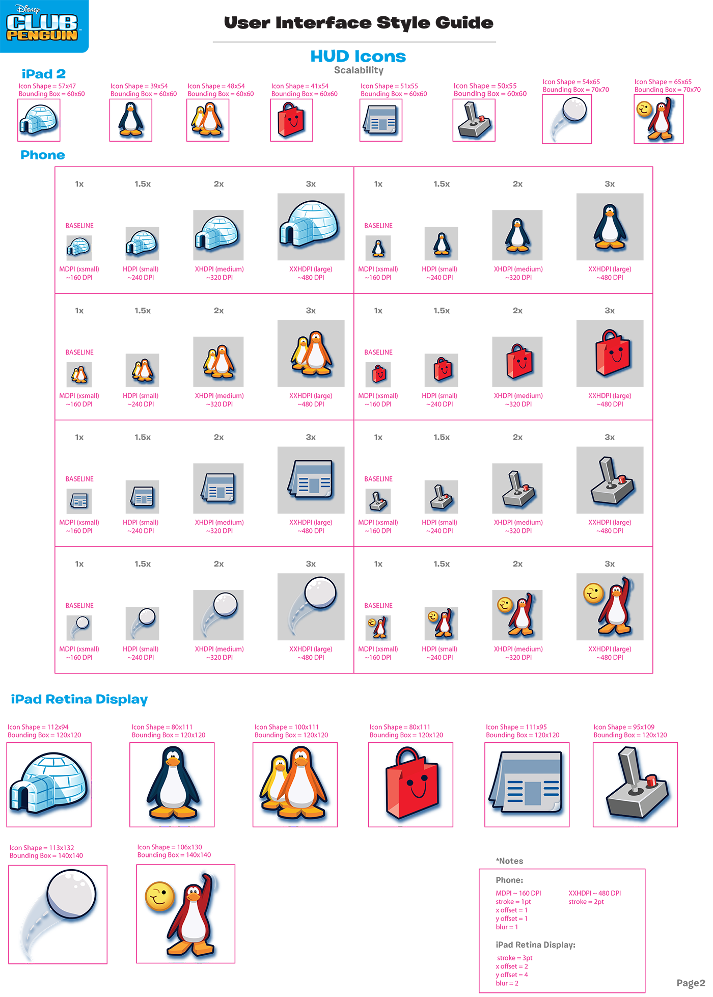
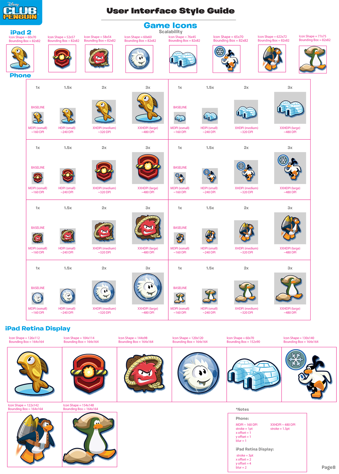
With many different devices and scaling involved with mobile I needed to make sure the icon line width scaled correctly. Here is a scalability page.
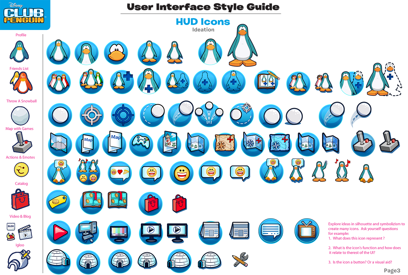
Here is a page if you look over to your far left, those are the original icons from the web version. I went through many different variations and ideations of each category as I begin to redesign and give CP a fresher look.
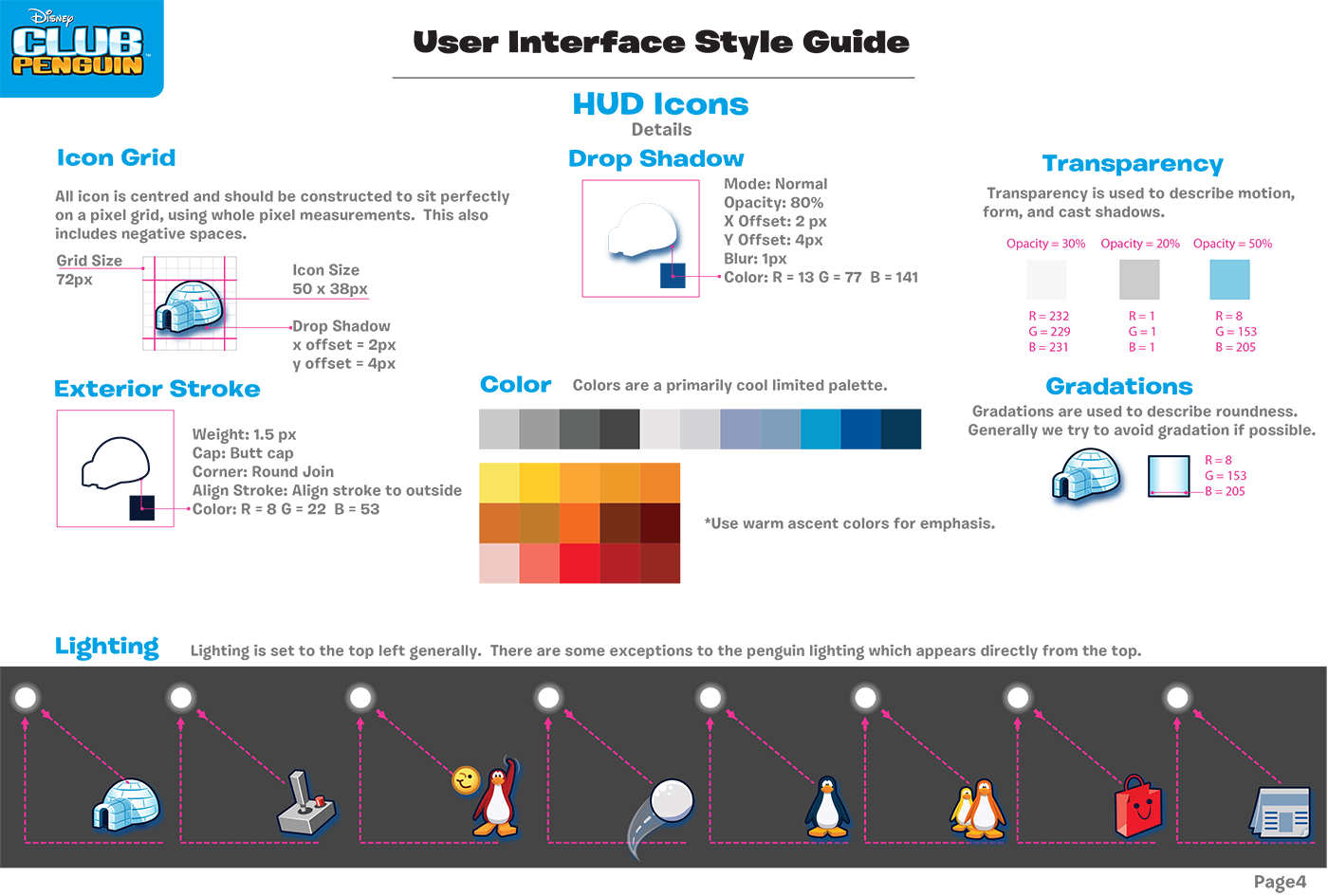
More detailed notes. Using lighting to unify the UI give consistency in the design.
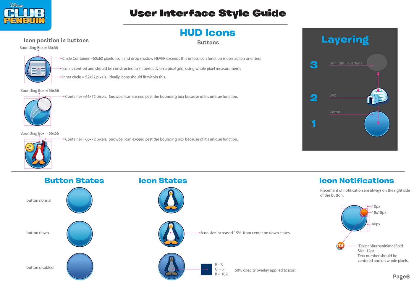
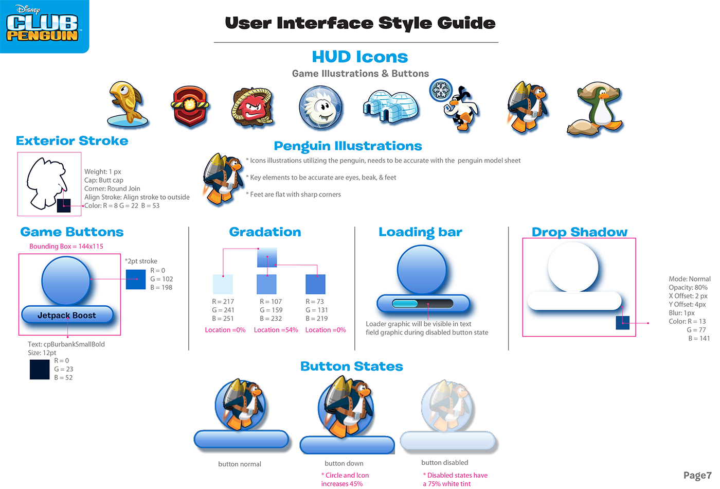
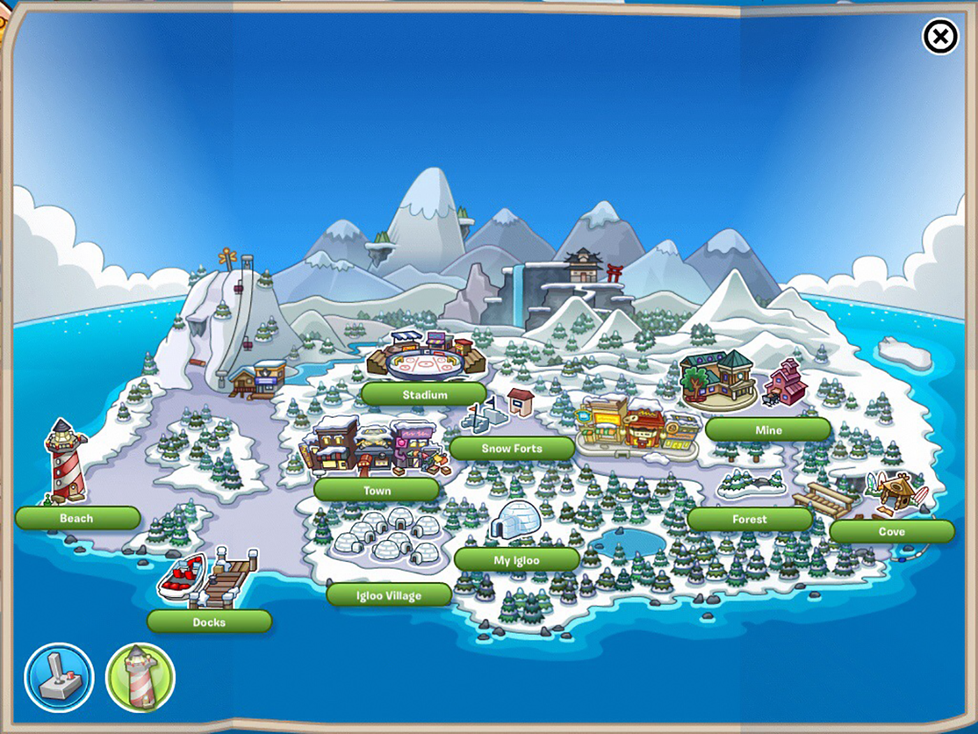
Here are all the main icons I designed. There were more but these were the main ones on the HUD and Map screens.
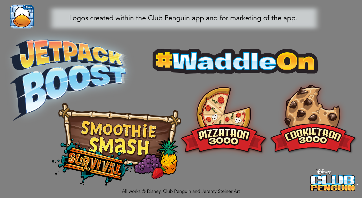
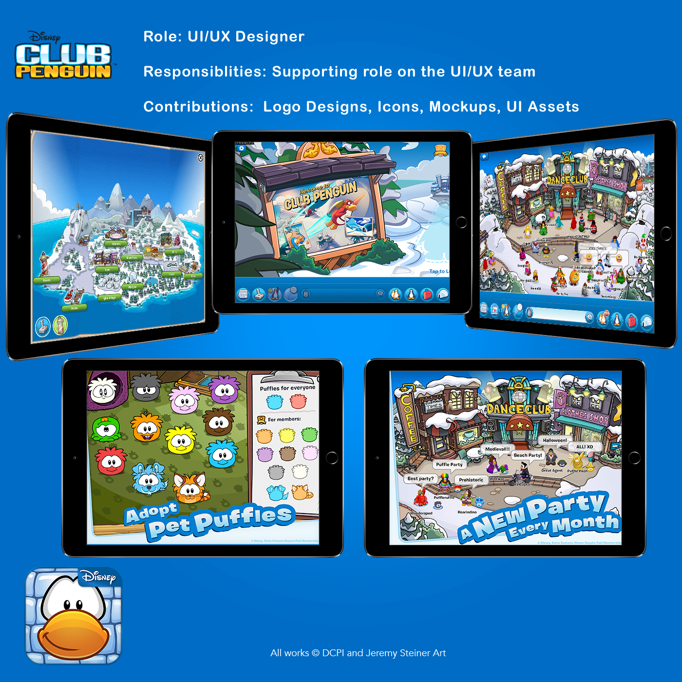
Logos designed for Club Penguin 1.2
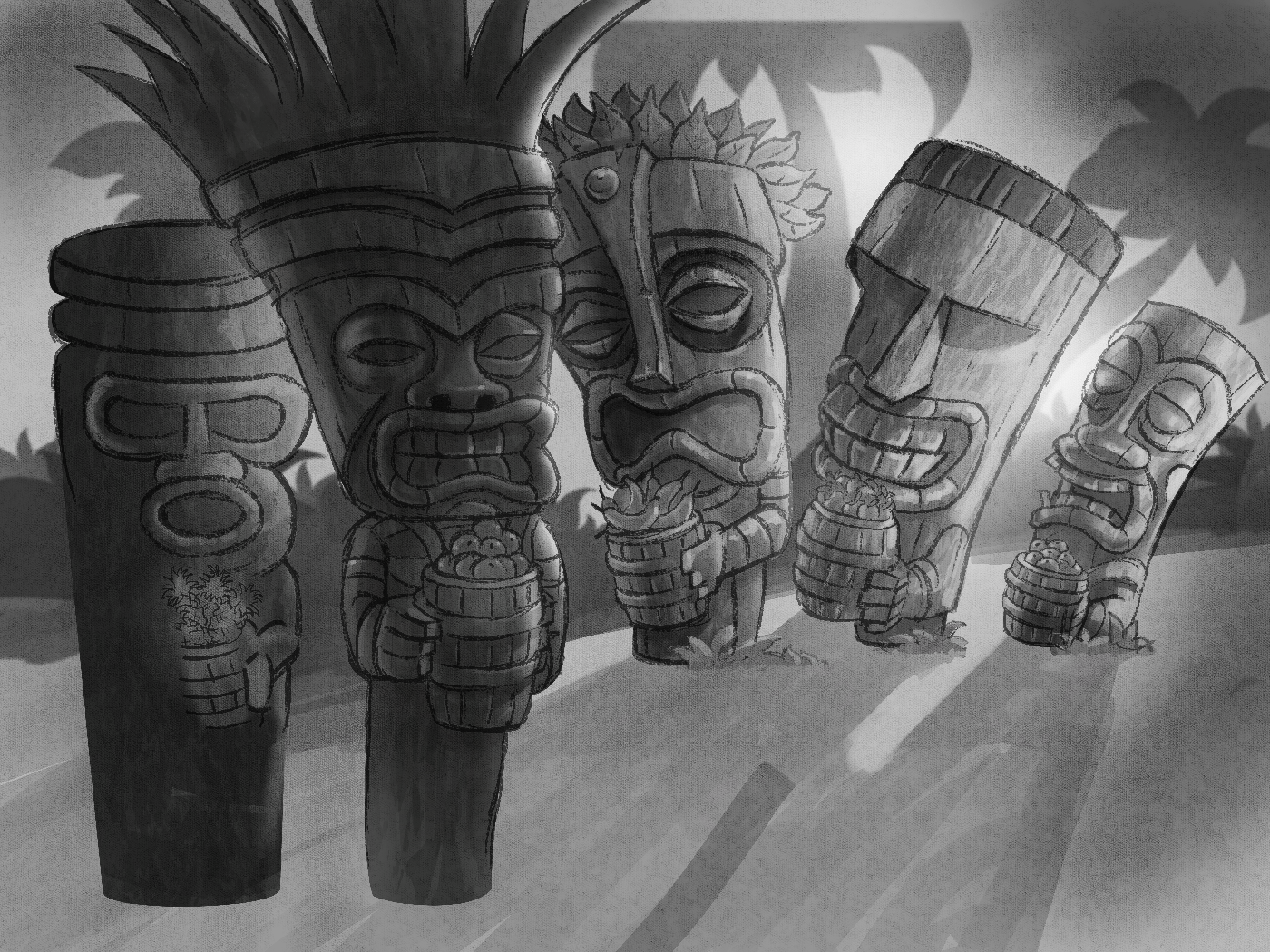
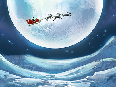
Concept Sketch of background for Smoothie Smash Survival game inside of Club Penguin
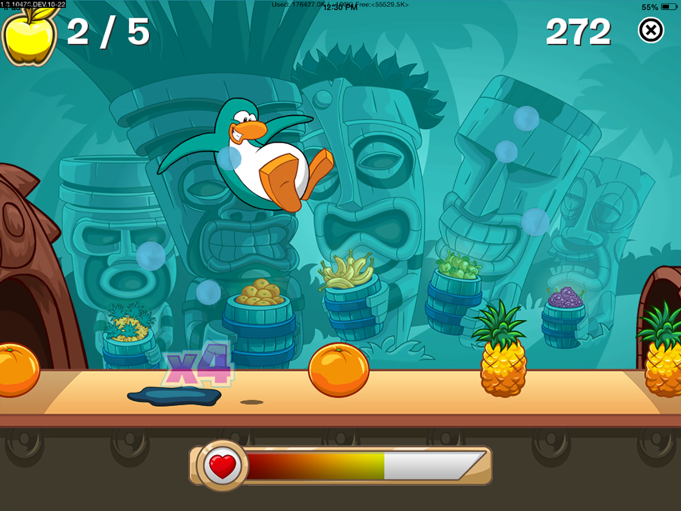
Finished in game screenshot of background for Smoothie Smash Survival game inside of Club Penguin
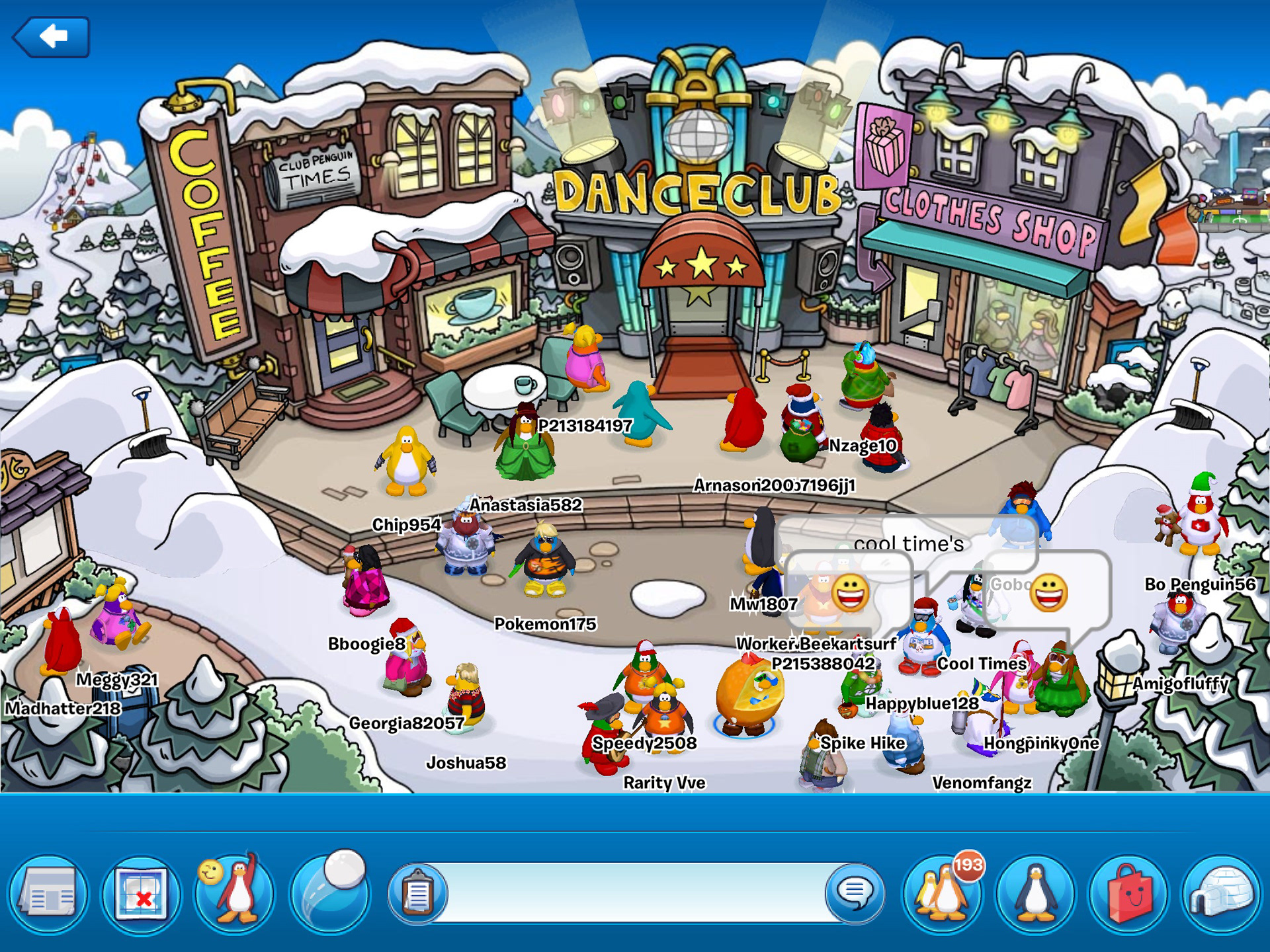
Screenshot of Club Penguin 1.2. Bottom HUD with my icons.