Here is a preview of of some of the 3D UI models. The shaders and textures are a bit different but generally the UI is the same. Credit to Alexa Kim, Yongwoo Cho, Christian Astillero, Taehoon Oh and James Chung and all of my friends at Studio Roqovan for this amazing opportunity!
Research
Research first was critical before starting work on this project and learning about the new Virtual Reality (VR) technology. The oculus store was a great place to start and it brought up all sort of questions and concerns, for example things like just knowing the platform headset and controller, head rotation and field of view, front facing UI for position of head, content zones to name a few things. I researched other VR products like Waltz of the Wizard, Budget Cuts, and Rec Room to see how UI was handled if in tied to your controllers or in world, how tutorials were handled, how tactile and accessible experiences can be. How movement can sometimes make a user sick if not handled properly calibrated and tuned and why so many VR experiences uses a teleport-like system for user navigation.
Discovery & Findings
How can we create meaningful design systems in 3D? - Stereoscopic images gives you the illusion of depth. Letting users spatially organize tasks can lead to a 40% increase in productivity
How can our past experience with Technology apply to VR? We can translate many of our understandings for how users interact with machines from our phones, computers and applies the same way we interact with VR. For example:
What are content zones? - are usually always pictures, video, text, & 3D models
How do user use applications? - are things to create and consume that content
How do users organize?- we organize that content into groups (ie.folders structures)
How do we use data? - we use meta-data n(tagging) is, we typically use meta-data to search for something quickly.
How do we use symbols & icons? - symbols & icons are our present actions and applications that cause actions, the little pictures helps us to recall them quickly by their shapes and color. They can have text descriptions or text name associated with them. A lot of these actions we just put them into menus as text.
How do users receive feedback? - In technology we use things like cursors default and hovering states, and audio to help us understand our input is effective.
When do users use a keyboard? - we are able to switch tools and modify our actions on the fly.
VR Cursors Research: laser pointer ( are there different states?) Used to select or move around, bring it closer, farther, or rotation. The problem is that it can shake with this system. Cursor actions look through a crosshair to select stuff like aiming a weapon. Cursors or touch-like method for menus in space is a common pattern in UX
Menus Navigation Research: radial menus or menus going around the hands switch tools or modify miniature map environment concept that can effect the world around you teleportation - jump from one place to the next.
Head Mounted Displays Findings
After reading Mike's research it became evident to me that meaningful content can only be enjoyed from about 65 and half feet give or take of distance and I was able to inform the development team the proper distance we should display our UI Popups, that can be seen and have a legible reading distance.
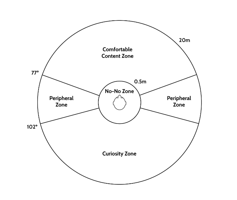
Credit: Mike Alger
Head mounted displays: In 2015 research project was conducted by Mike Alger on the subject of VR headsets was researched and published as he estimated the maximum perceivable depth for a head mounted display. In his work, he articulated in detail his findings and observances of the current VR consumer products such as Rift, Vive, or Gear VR. ... "nearly the same 20 meter every time. All other distances exist within the anti-aliasing and interpolation of a single pixel. Content beyond this distance of approximately 20 meters loses the benefit of depth perception and can thus be deemed the far horizon at which meaningful content should be placed. This results in the following zones diagram above."
Other interesting finding included:
Head Rotation: Field of View: 94 degrees with circular field of view. Horizontal Rotation: comfortable rotation 30 degrees and max 55 degrees. Up & Down Rotation: 20 degrees comfortable, max 60 degrees
Straining Angles: Headset restriction- sitting, standing standing but staying still, rotating with a max field of view but wire can tangle you up. Depth Perception from Samsung: Past 20 meters you loose the benefit of 3D
Wireframes
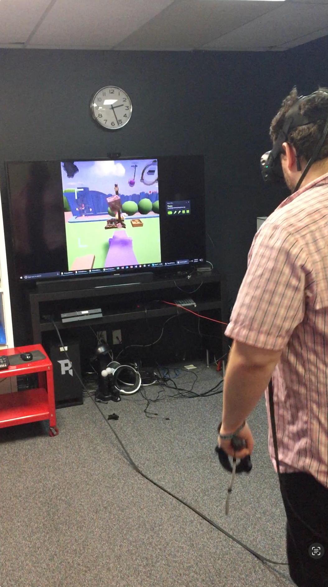
One of the pain points with the current experience using the VR controllers is user is not familiar enough with the technology and was confused on how to navigate combined with the experience being a sandbox. It became clear early on that we needed a tutorial system .Another key element was setting up your stunt and pressing play. The Vive controllers had a touch pad to bring up the which was very hard to use and the menu UI had a ton of information in it already, so bringing out the play button separating it out of the hidden menu system allowed users to easily experience what they had built.
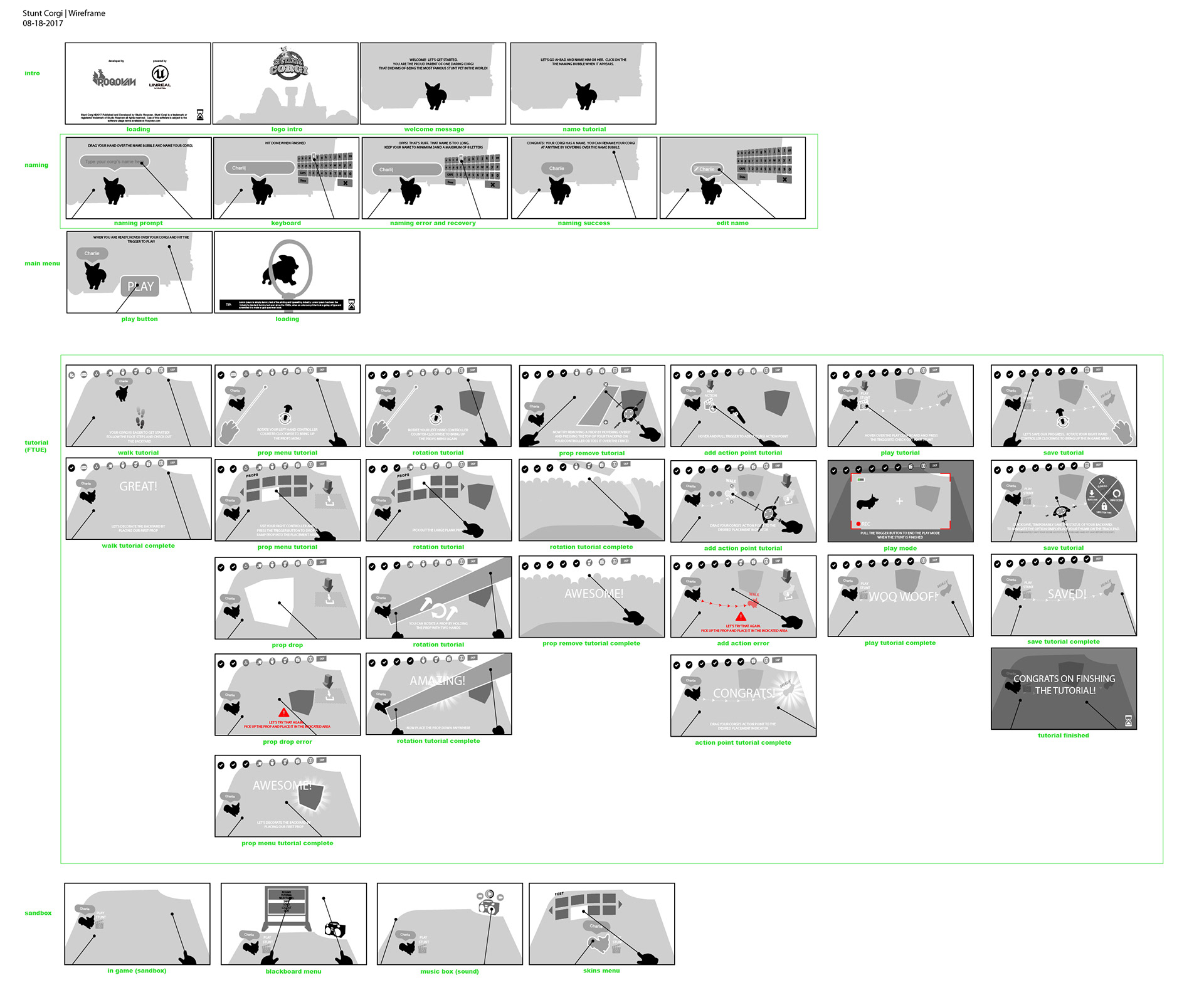
Early implementation. The primary "ACTION" CTA was initially hidden in the wheel UX and was hard to find. This created frustration among users and slowed the process down to test to see if your stunts would work. I suggested pulling this primary button out of the wheel early in the production.
Keyboard UX, Name your Corgi UX FTUE from early wireframes
Corgi skins menu, tied to your Corgi in the environment, other UI spatial designs, settings, main menu, keyboard, music sound box
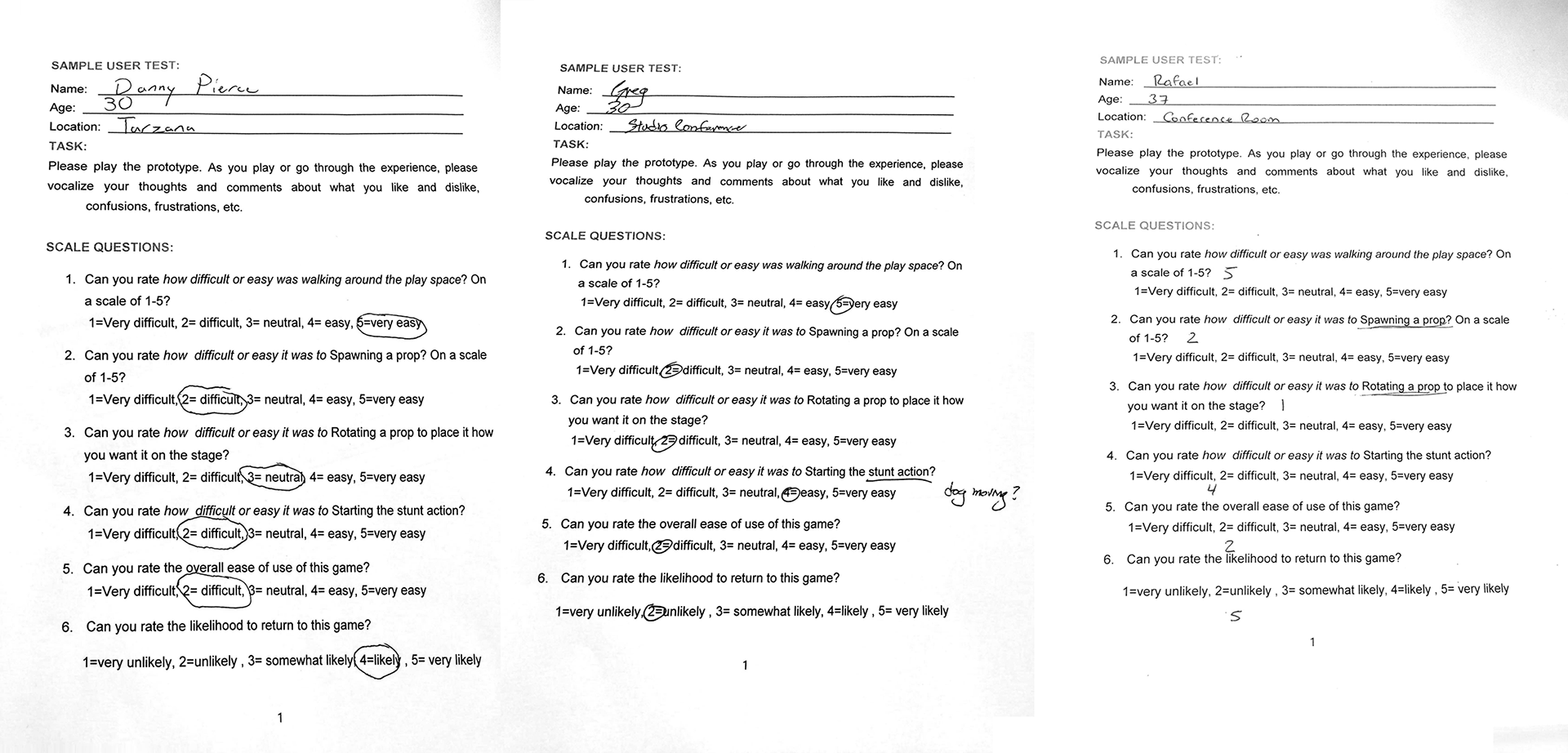
Play Tests and Survey Questions
We had limited resources to validate our design decisions. To get qualitative feedback, I scheduled and organized a day of user testing with our internal development team of the latest beta build. 2 user test in the morning and 2 in the afternoon. I worked directly with the game designer on key gameplay mechanics and usability questions using a basic 1-5 scale rating system to get initial feedback.
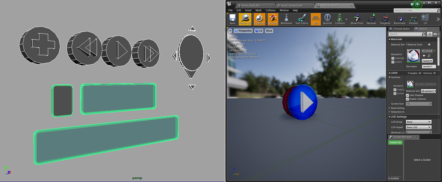
3D UI Design System
I experimented in Maya and built out a 3D UI interface and played around with different shaders in the Unreal engine
Logo Design Exploration
My initial design lead to the inspiration of the final logo design.
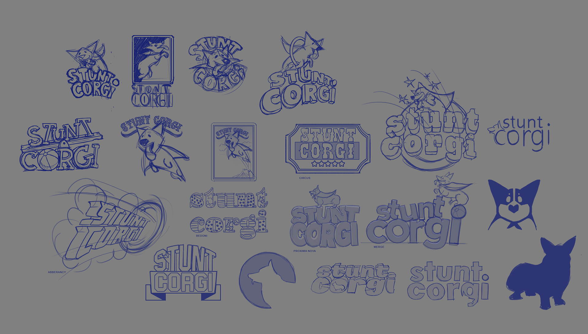
Early Logo Explorations