Role: Senior UX UI Designer
Team: Edison Cruz (Product Manager), John Eberhardt (Lead Game Designer), Taylor Benson (Producer), Sean Mclaughlin (Lead UX Designer & Art Director)
Developer: 2k CatDaddy Games
Client: ViacomCBS
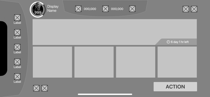
Home Screen Look Development
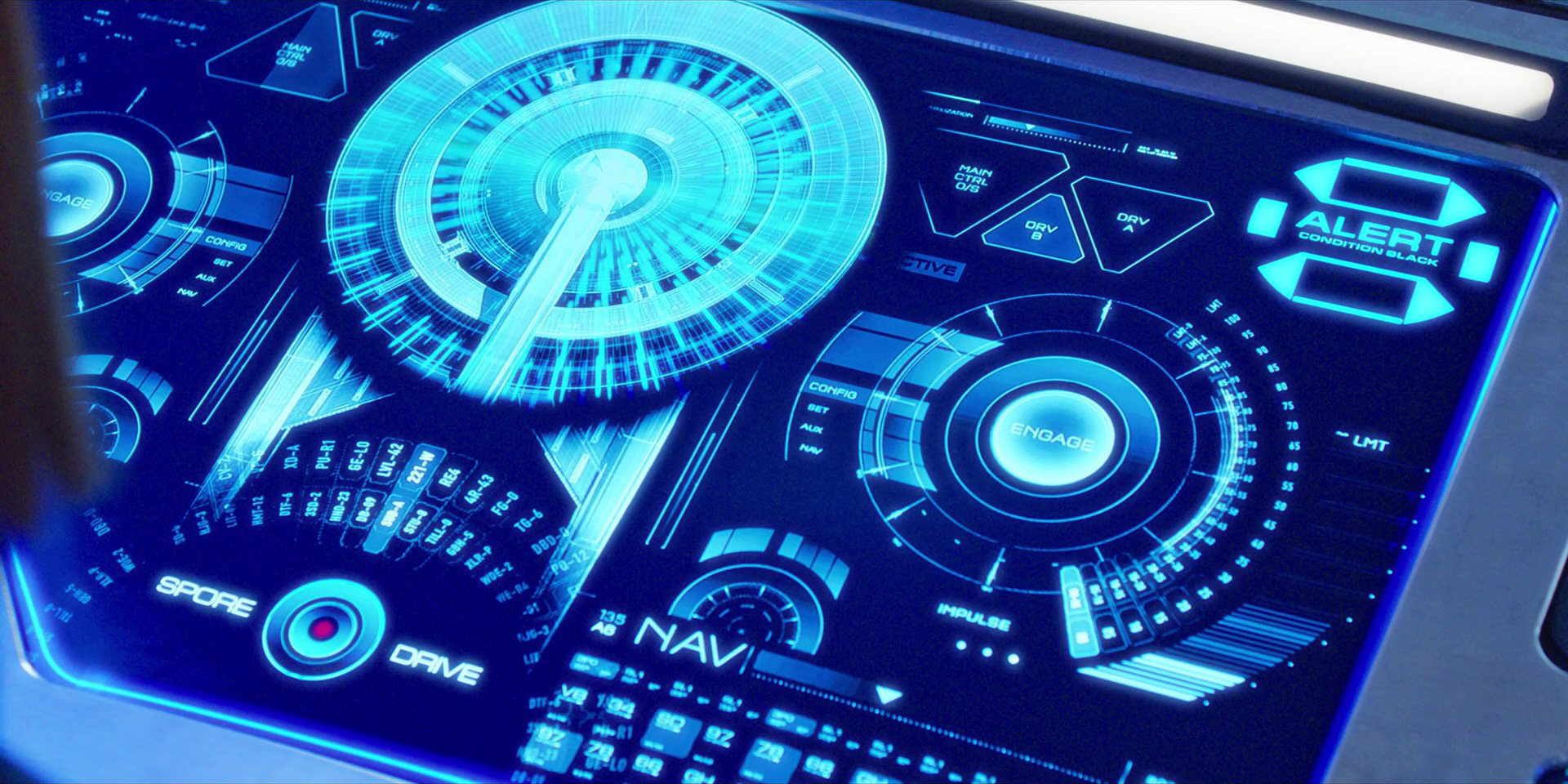
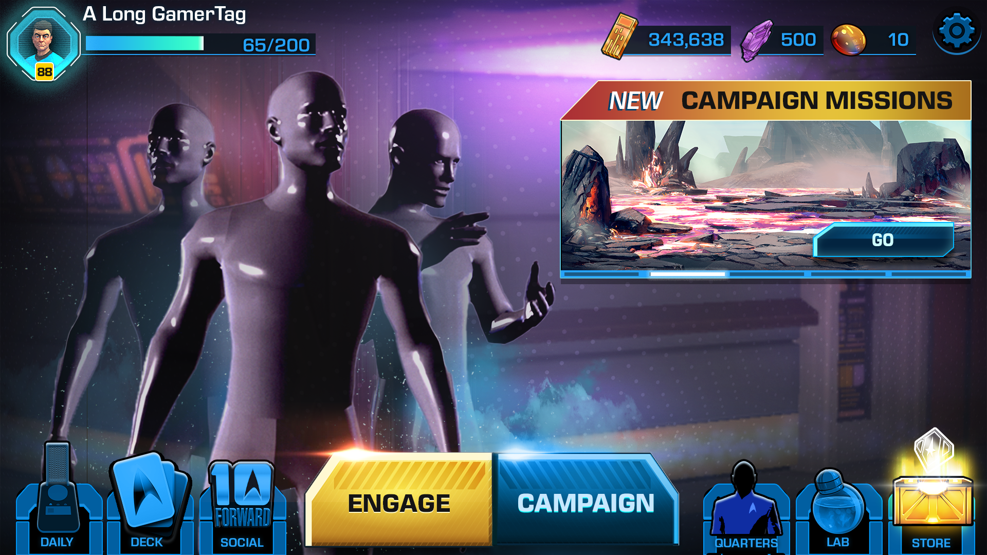
Final Home Screen. The Yellow & Blue Skeuomorphic Themed Comp was taken to the a higher level of fidelity.
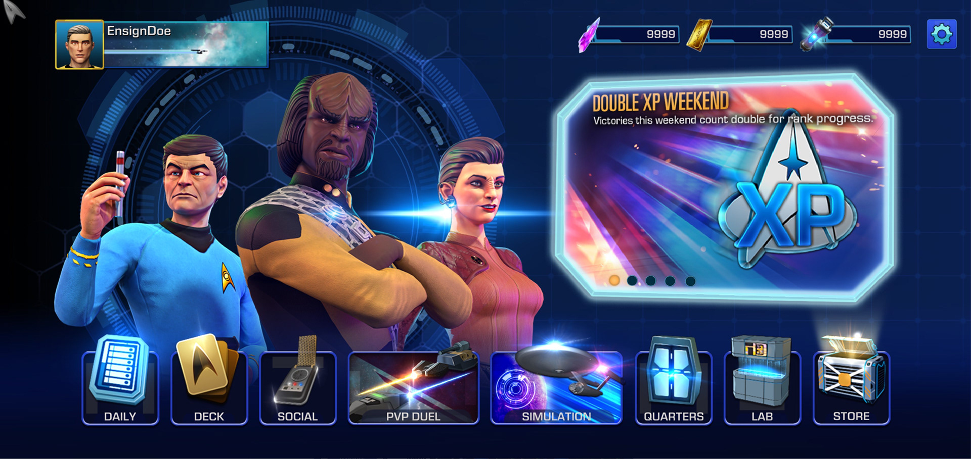
Goals: Brought onto Holodecks (2K | Cat Daddy Games, 2021) to reskin and improve the Home Screen UI. The existing design felt unfinished, off-brand, and inconsistent across menus. With limited time and resources, I streamlined the interface, unified layouts, and refined visuals drawing inspiration from Star Trek: Legends to deliver a cleaner, more cohesive, and on-brand experience.
Research: Inspired by the work of Mike Okuda, Andrew Jarvis, Timothy Peel and StarTrek Atlas & Discovery. For mobile I researched
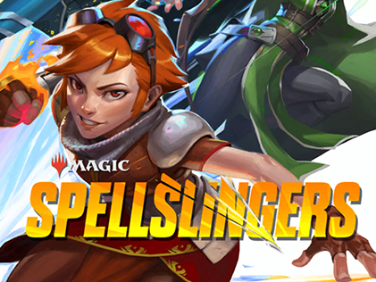
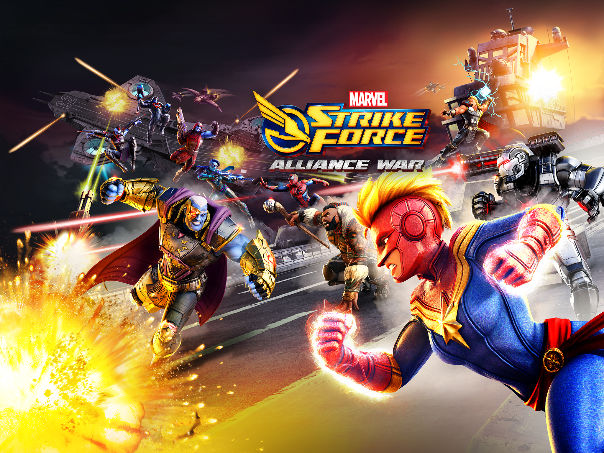
Challenges: The biggest challenge was navigating the vast visual history of Star Trek and distilling it into something cohesive and modern while aligning with CBS brand guidelines and high expectations for authenticity and polish. With limited time, I reviewed an enormous amount of imagery and documentation, including artwork by Mike Okuda LCARS, Andrew Jarvis and LCARS II, Star Trek Discovery, Timothy Peel, and the Star Trek Atlas. I also studied internal team materials, CBS brand reference documents, and mobile games such as Star Trek Legends, Star Trek Adversaries, Marvel Future Revolution, and Marvel Strike Force to ensure the final direction felt authentic and on-brand.
CBS noted that the existing visuals were not hitting the visual target and provided feedback referencing modern titles like Star Trek Legends for their clean layouts, readable class types, and subtle color variations. They also found the blue color palette generic and called out inconsistencies in shapes, menus, and button placements. Their feedback guided the redesign toward a more unified visual system that aligned with brand standards by simplifying the interface, refining shapes, and removing distracting patterns and gradients.
Solutions: I focused on improving and benchmarking the visual direction of the game, beginning with an exploration of the Home Screen UI. I started by building a mood board of reference imagery to capture Star Trek’s visual identity, followed by wireframe explorations to test layout clarity, hierarchy, and usability.
From this research, I developed three primary visual directions: an LCARS-inspired theme rooted in classic Star Trek design, a Discovery Tech theme reflecting a modern cinematic look, and a yellow and blue skeuomorphic style aligned with 2021 mobile trends yet still on brand.
To create these concepts efficiently, I produced wireframes in Figma, storyboards and sketches using Photoshop and Wacom, and visual explorations using Adobe Illustrator for vector layouts and Photoshop paint-overs that combined photography and 3D elements. This workflow allowed for fast iteration and visual benchmarking that clearly communicated the design direction.
Throughout the process, I focused on clean, crisp UI that addressed CBS’s feedback by improving hierarchy in call-to-action buttons, ensuring secondary and tertiary buttons carried less weight, and following best practices with intuitive HUD placement along the bottom or sidebar. The result was a more cohesive, modern, and brand-aligned interface.
Outcome:The team ultimately chose to move forward with the yellow and blue skeuomorphic style, which best balanced modern mobile trends with the Star Trek brand. I completed the final mockups within the remaining production window, delivering a cohesive and visually refined UI direction. Although the project was later cancelled and Holodecks was never released, the exploration set a strong visual benchmark and provided valuable insights for future 2K mobile titles.
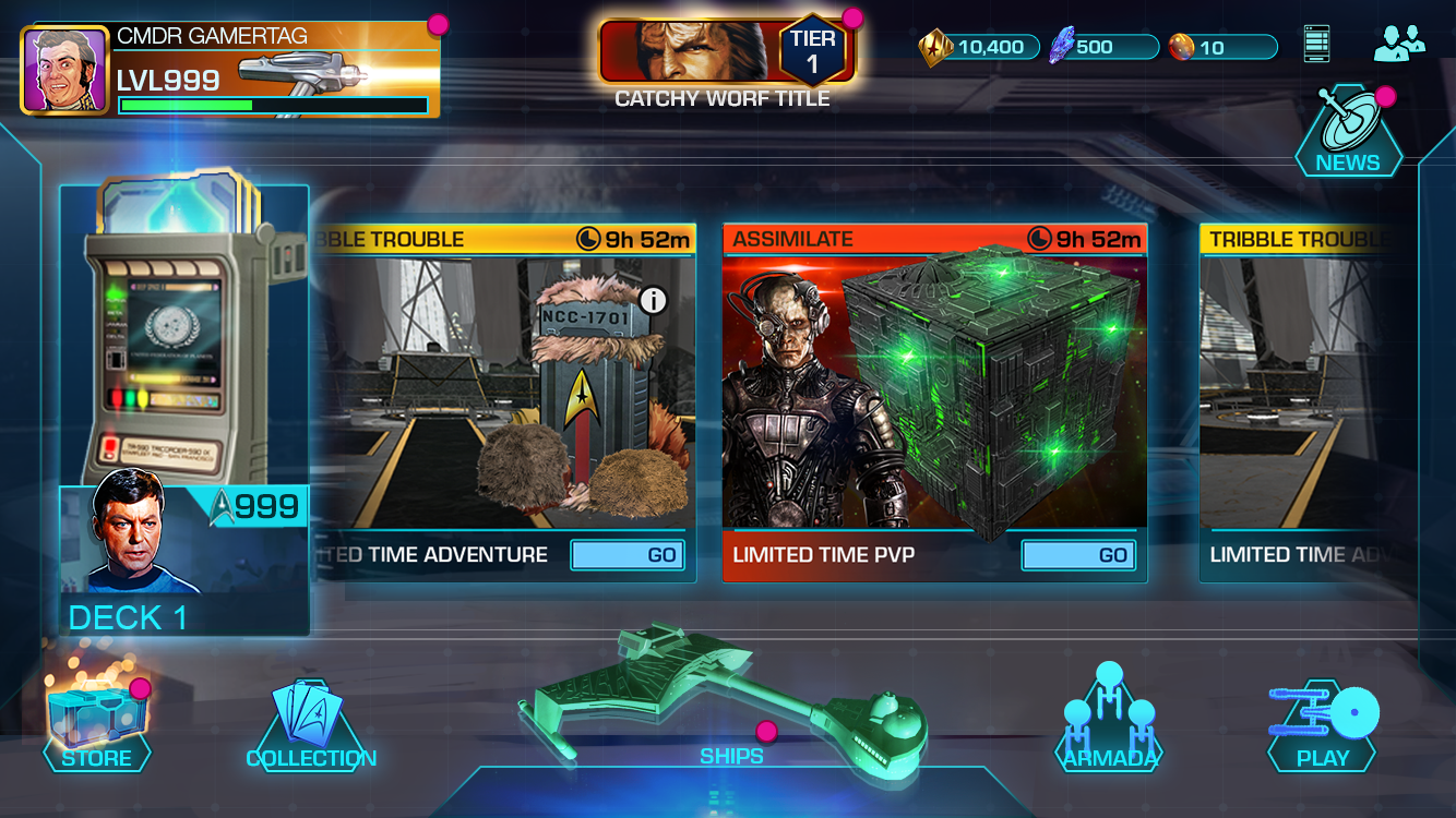
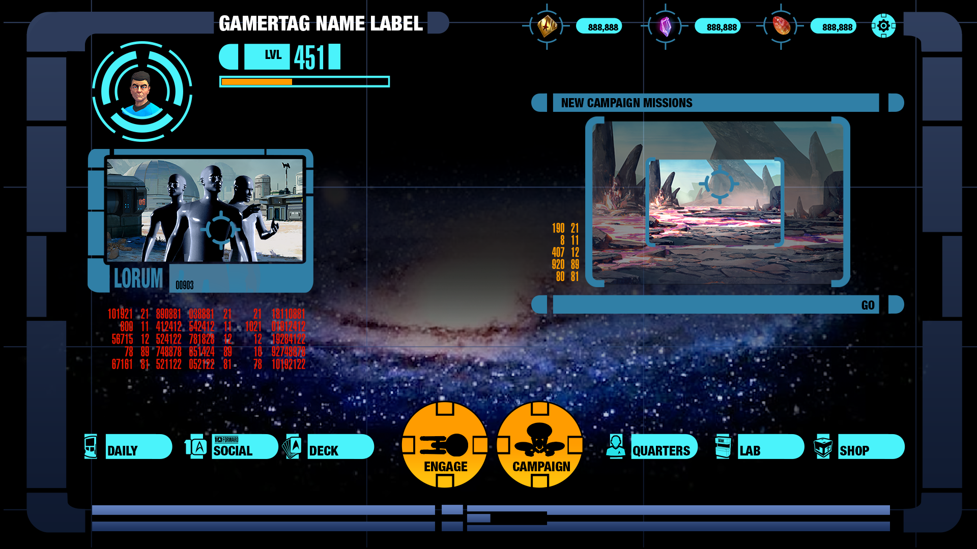
Existing UI Design
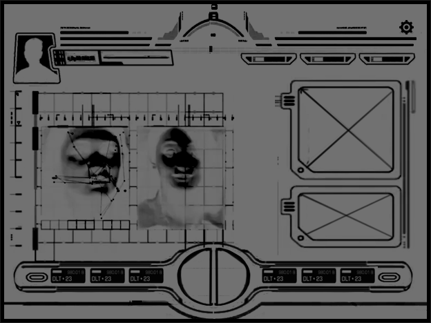
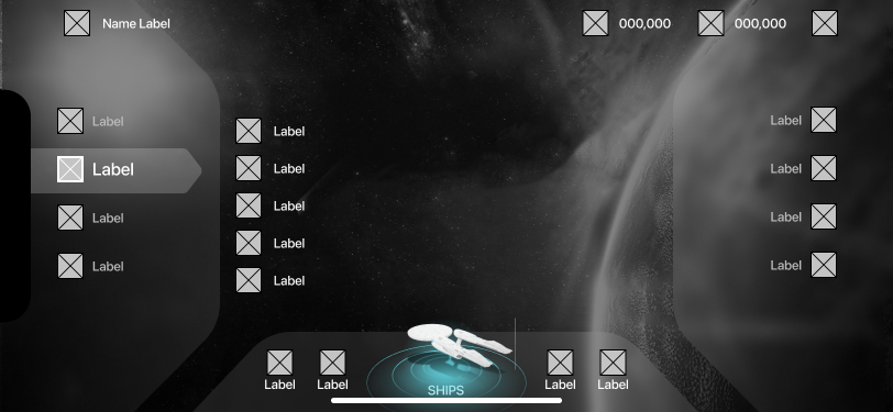
Research
Andrew Jarvis Reference LCARS
Discovery Reference
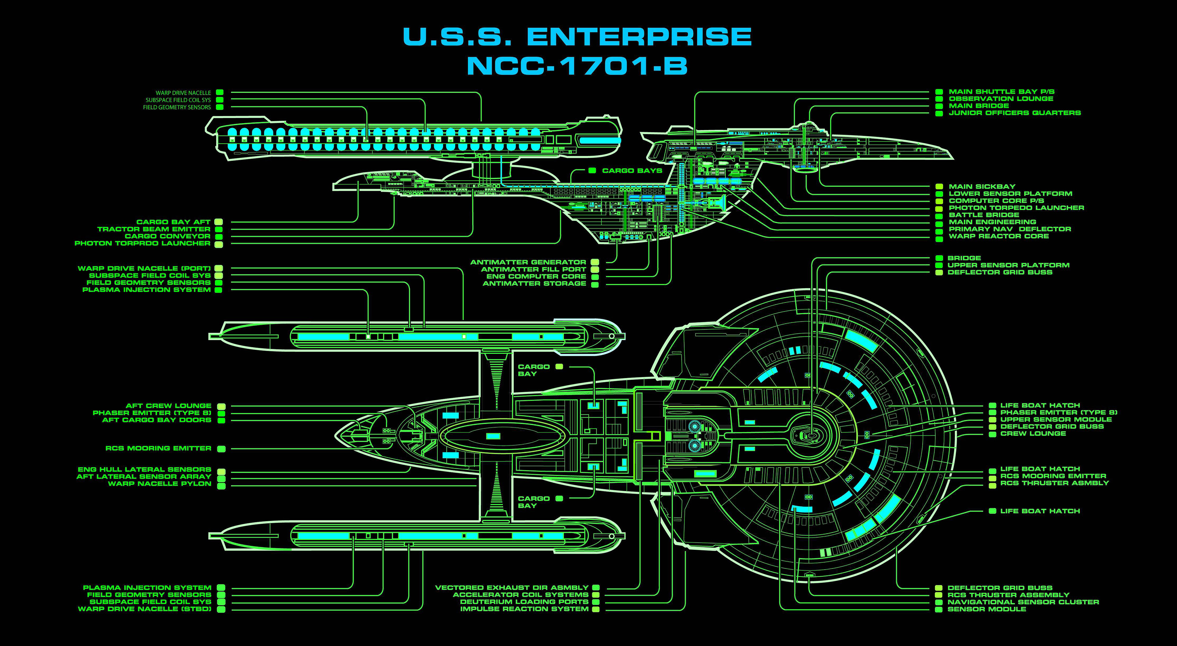
Reference Excelsior_class_refit_MSD
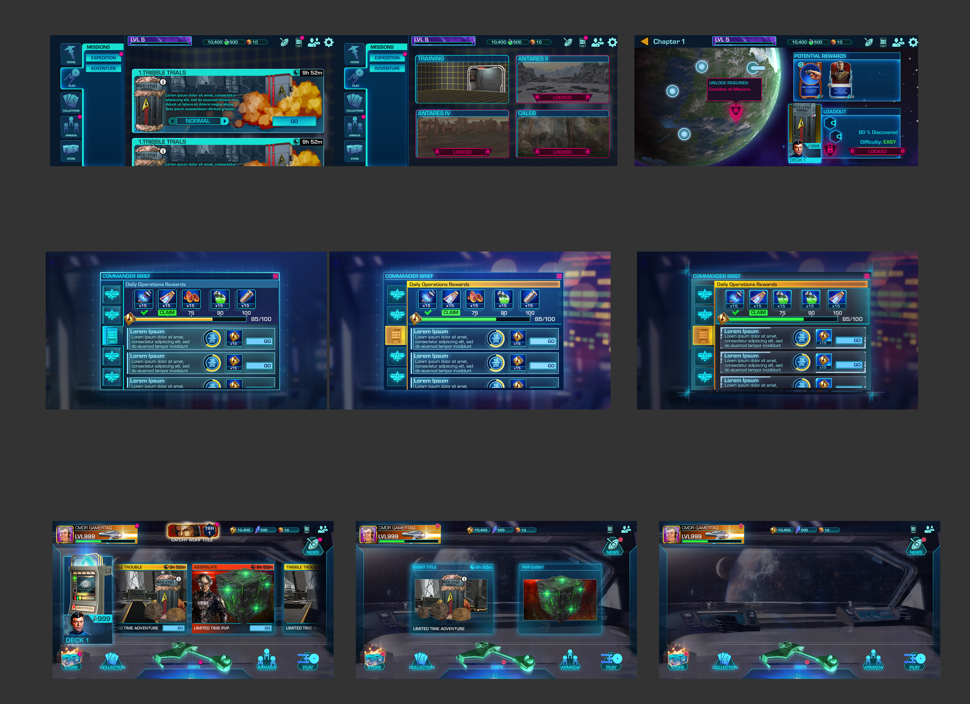
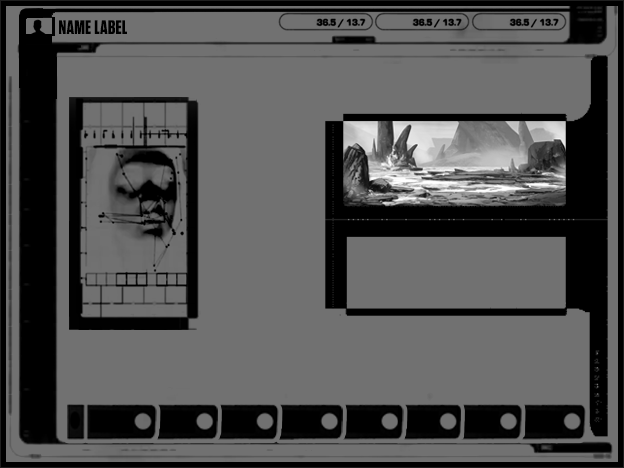
Thumbnails
Exploring character-based, ship based, graphical based ideas and themes.
Quick Thumbnail
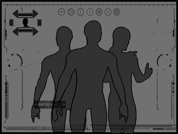
About the Heroes
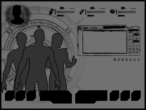
Heros & Info & Nav
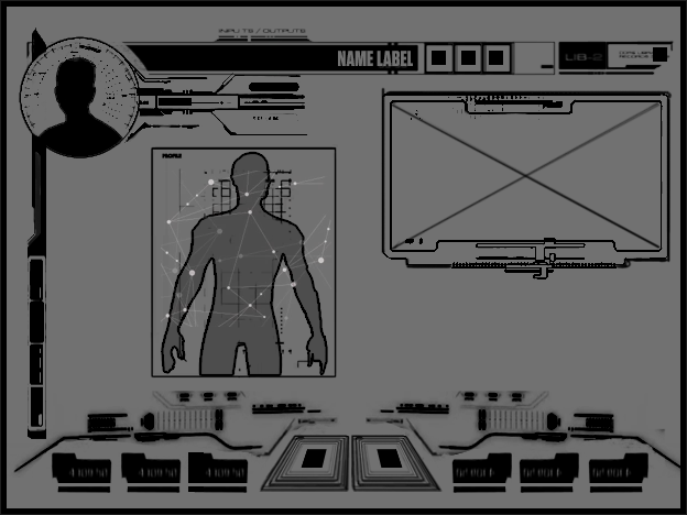
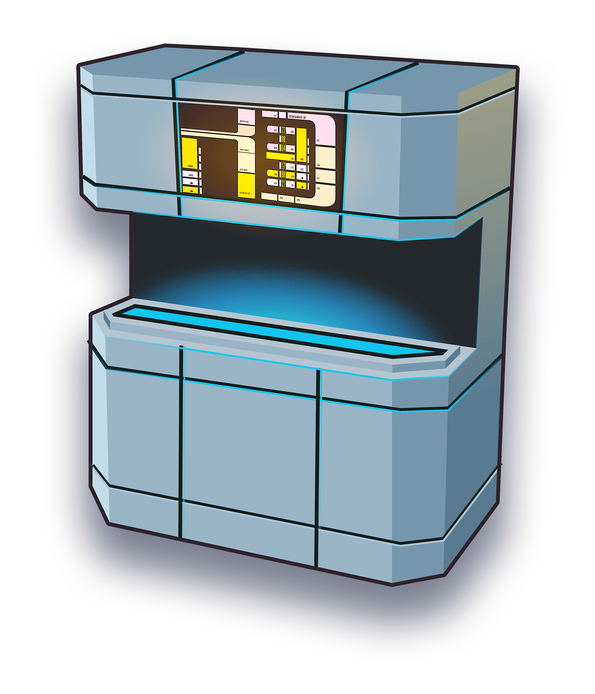
Systems
Inspired by LCARS
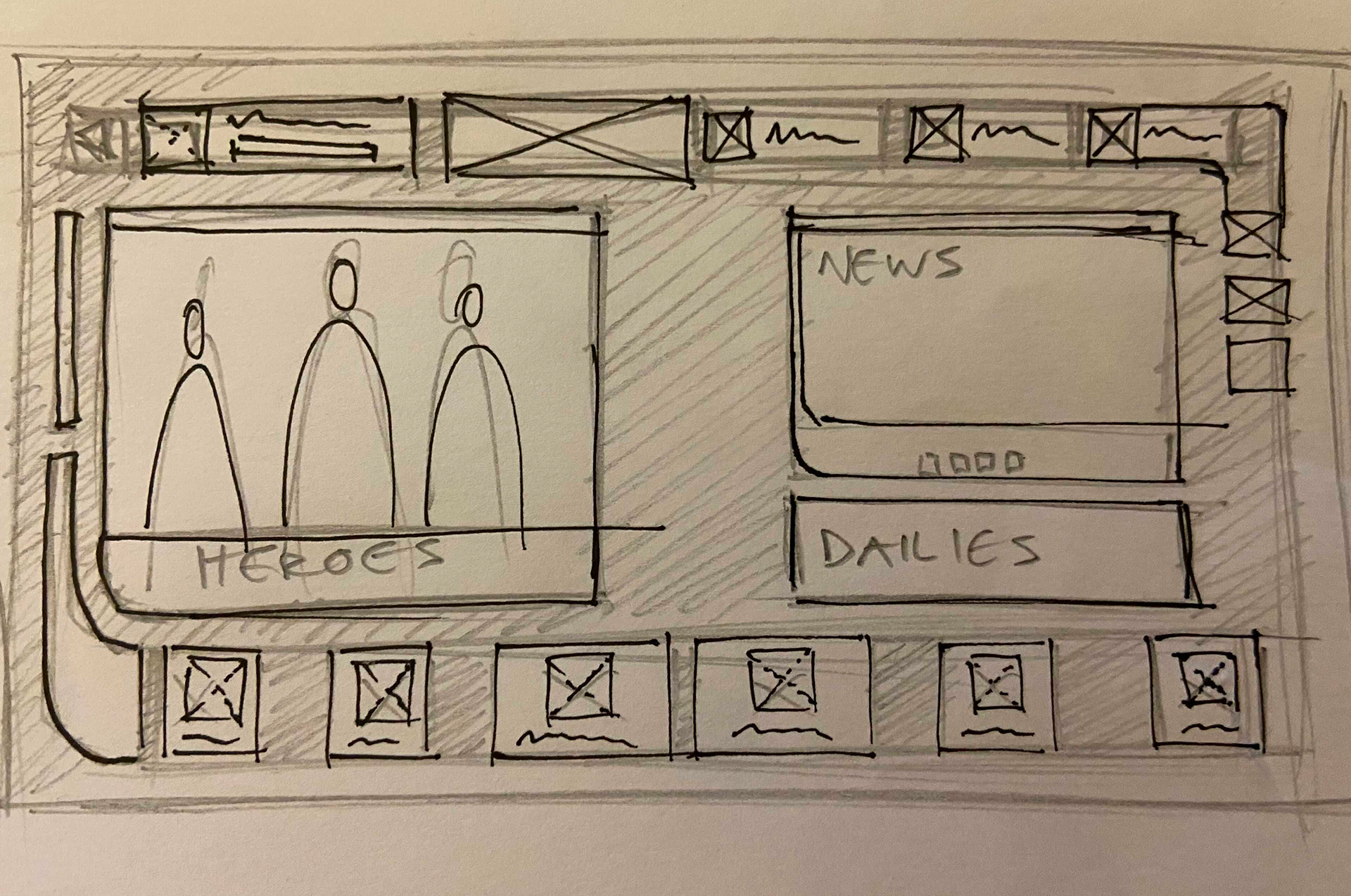
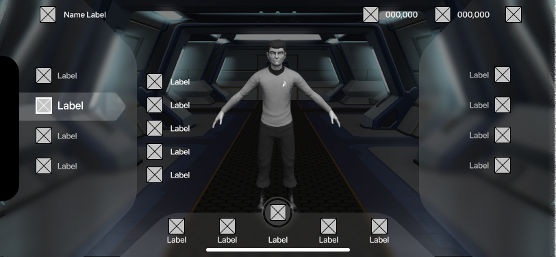
Landing Screen Wireframes
I wanted to make sure that the navigational buttons were clear, easy to find on device and that the primary action was accessible to the user's thumbs at all times.
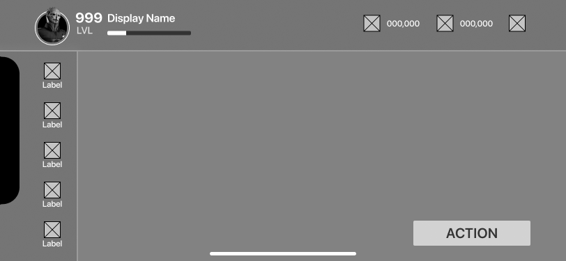
Screen Wireframe v1
Screen Wireframe v2
Screen Wireframe v3
Screen Wireframe v4
Screen Wireframe v5
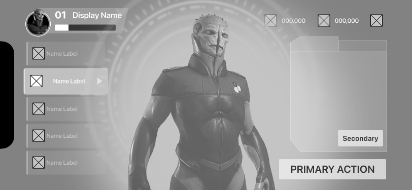
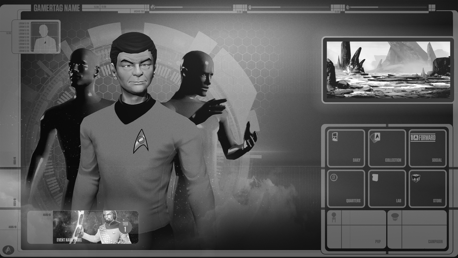
Refined Black & White Mockups
Themes include Yellow & Blue Skeuomorphic, Flat Tech Graphic, & LCARS Themed Comps
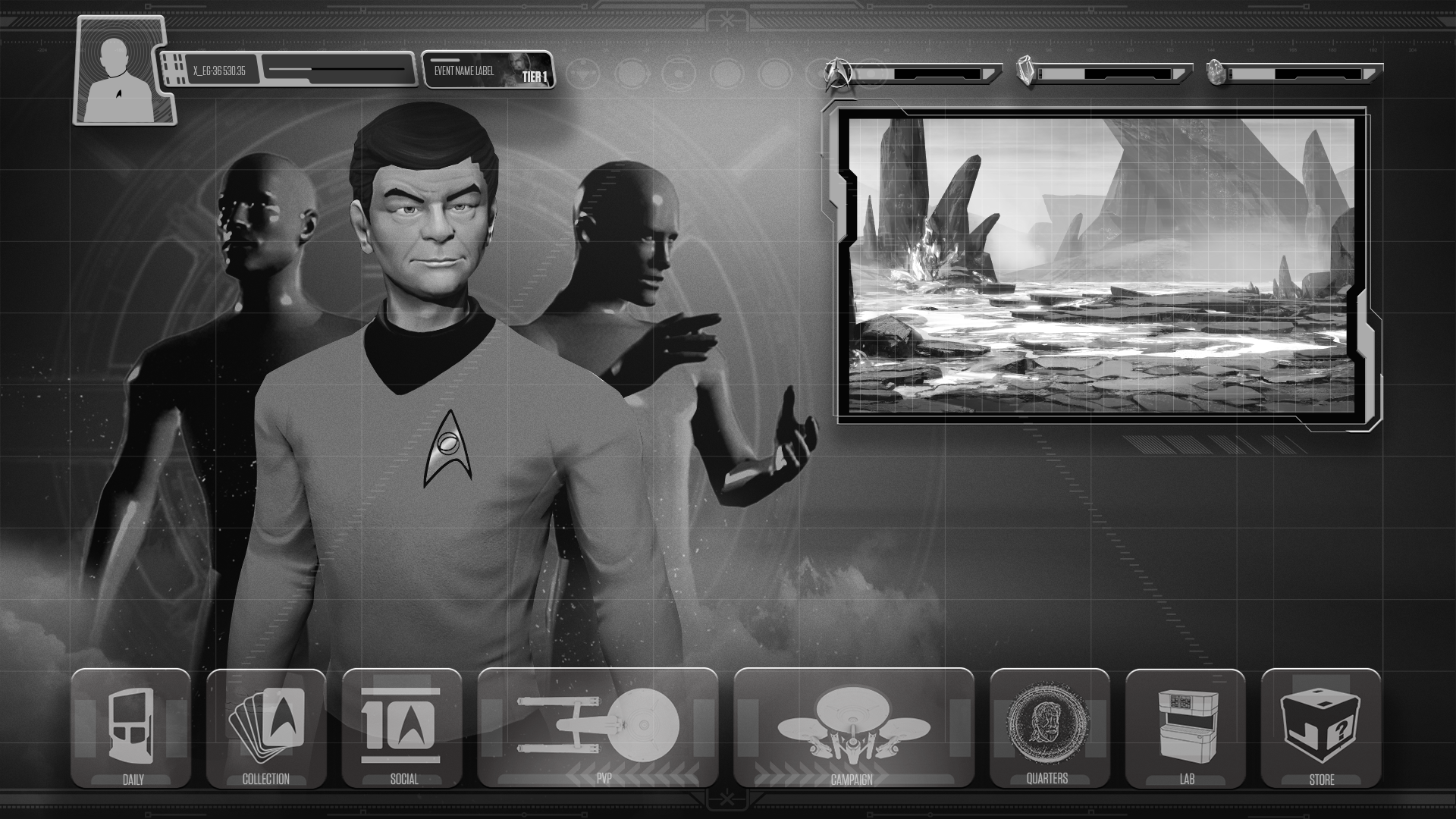
Rough Mockup A
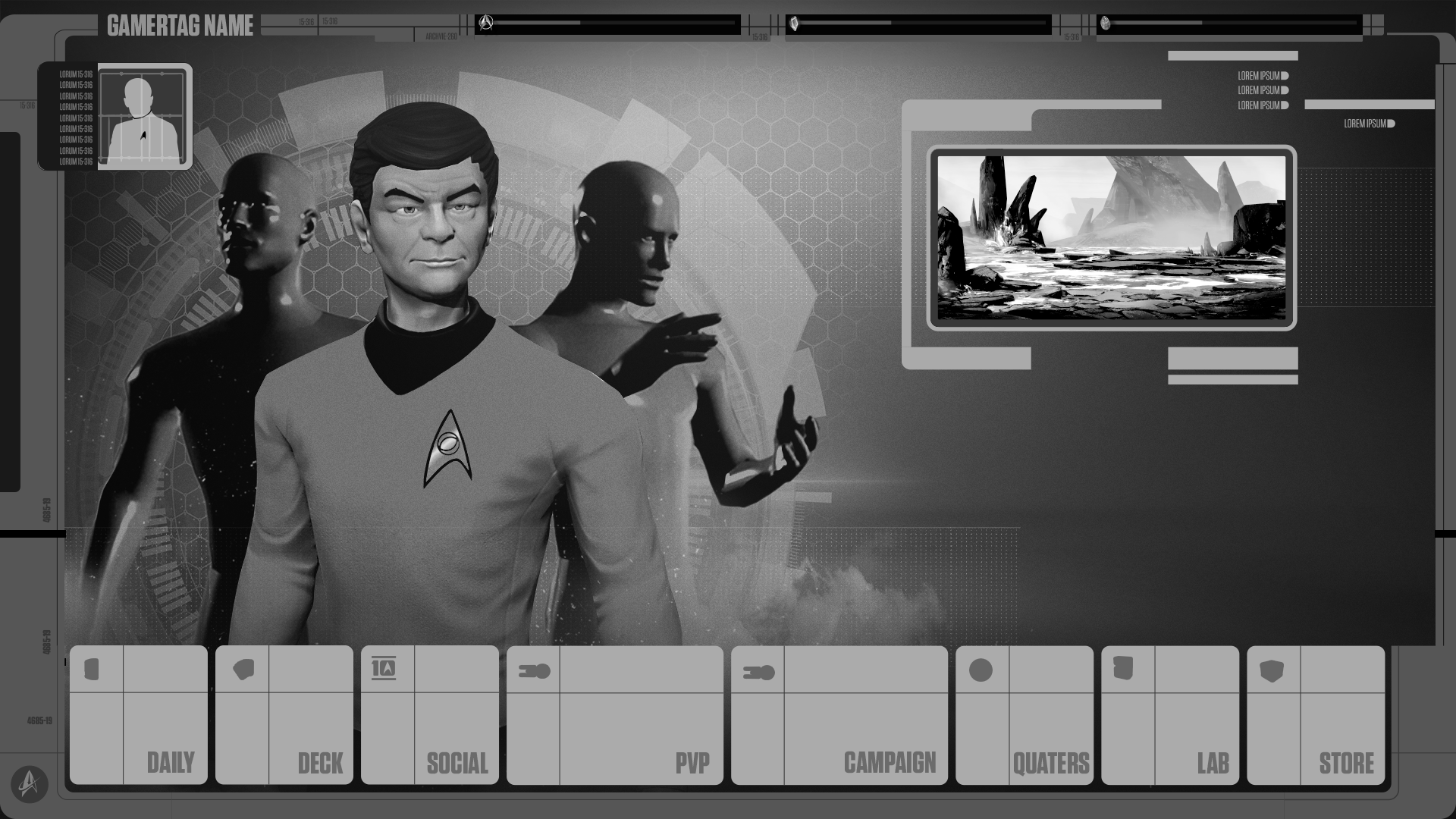
Rough Mockup B
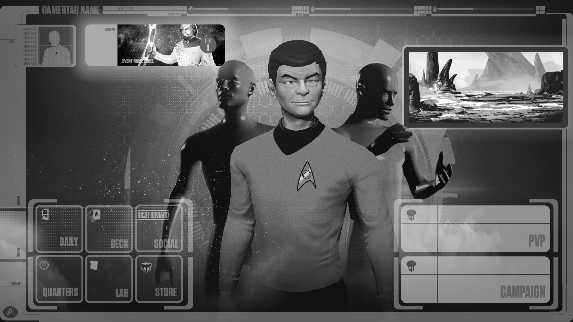
Rough Mockup C
Rough Mockup D
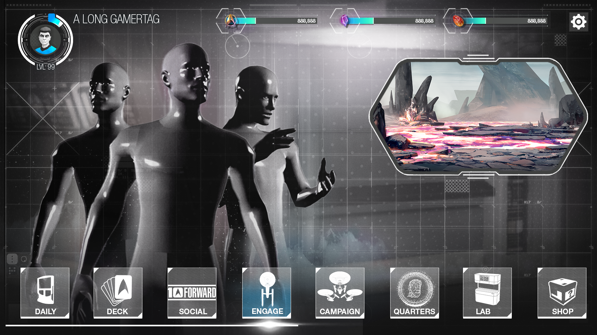
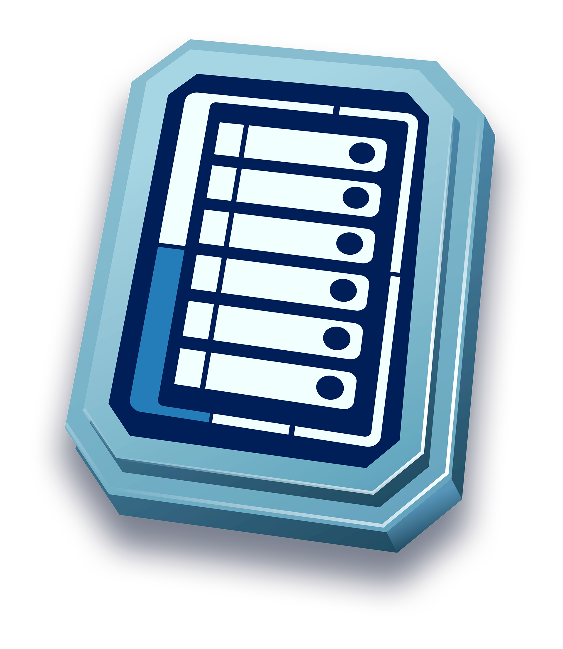
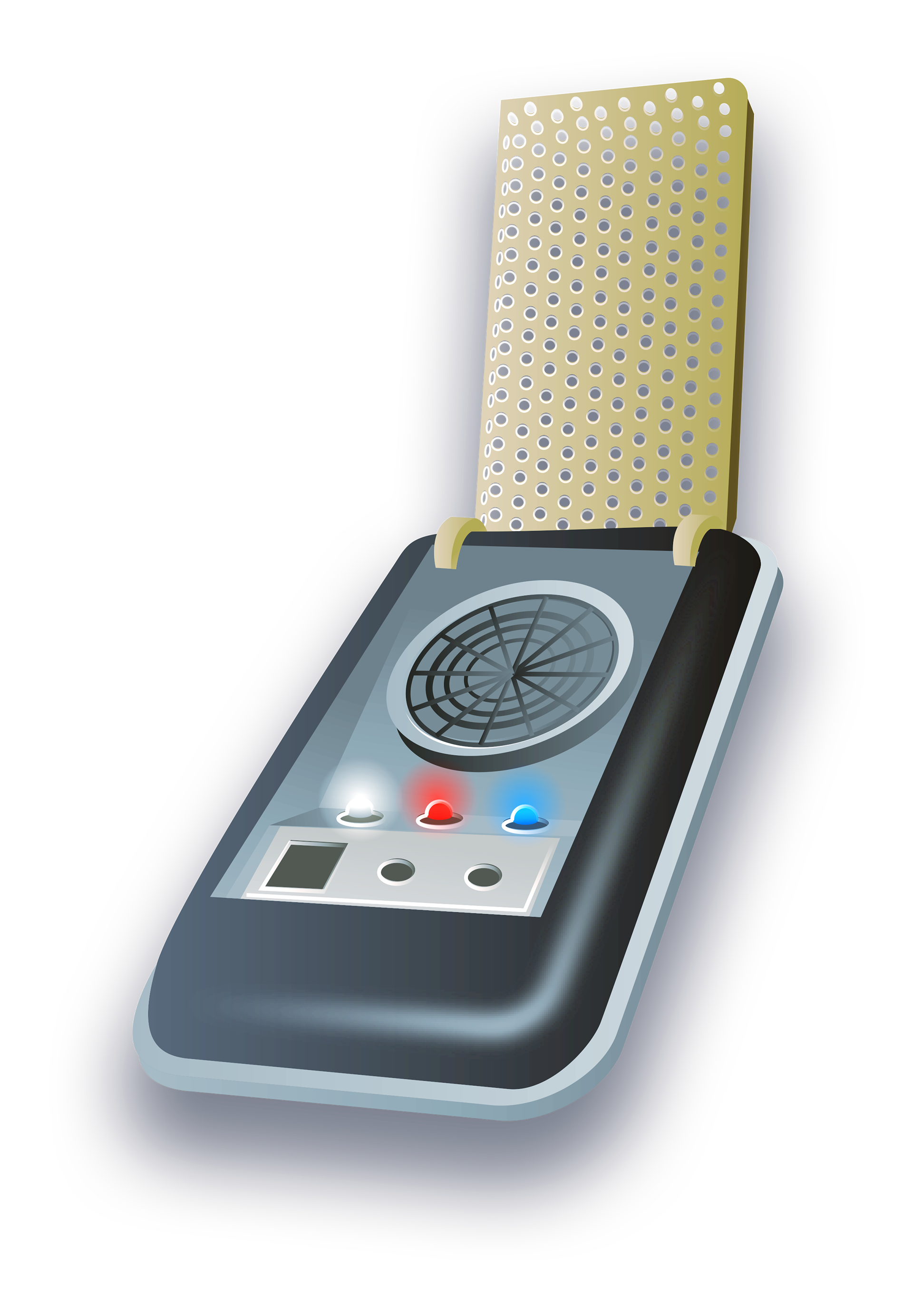
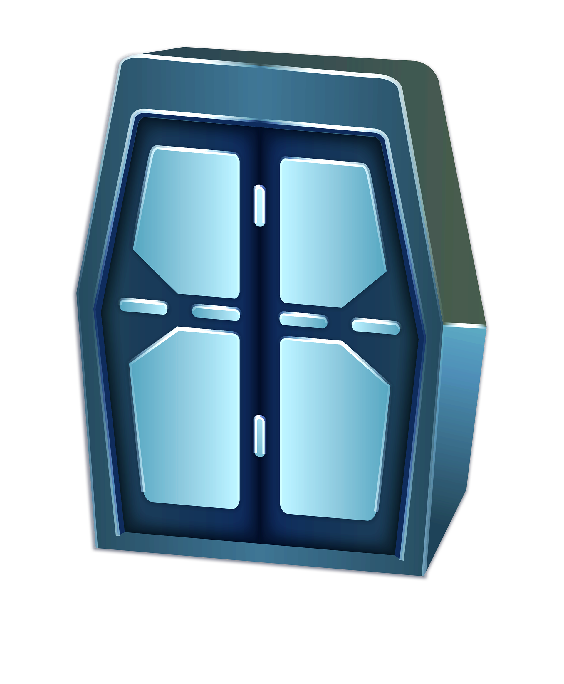
Bottom HUD Nav Icons
After the themed comps exploration, we decided that the Yellow & Blue Skeuomorphic Themed Comp would be the best direction moving forward with the time restraints that we have and it was the most successful in terms of clarity and usability on a mobile device. The below icons attributes contain real world lighting, physicality and dimensions.

Collection Icon
Daily Icon
Social Icon
Quarters Icon
Lab Icon
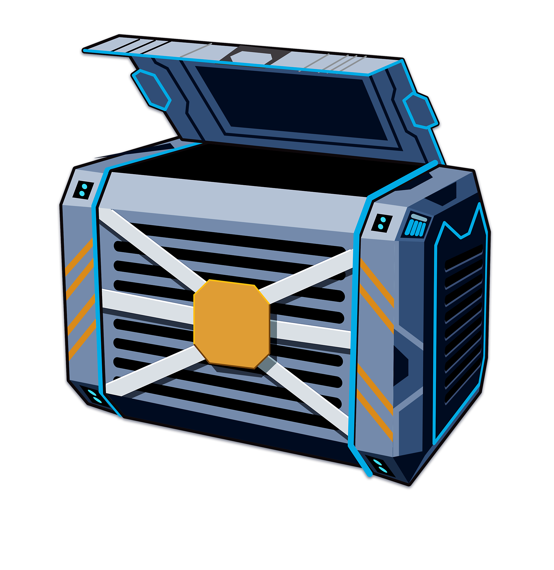
Store Icon
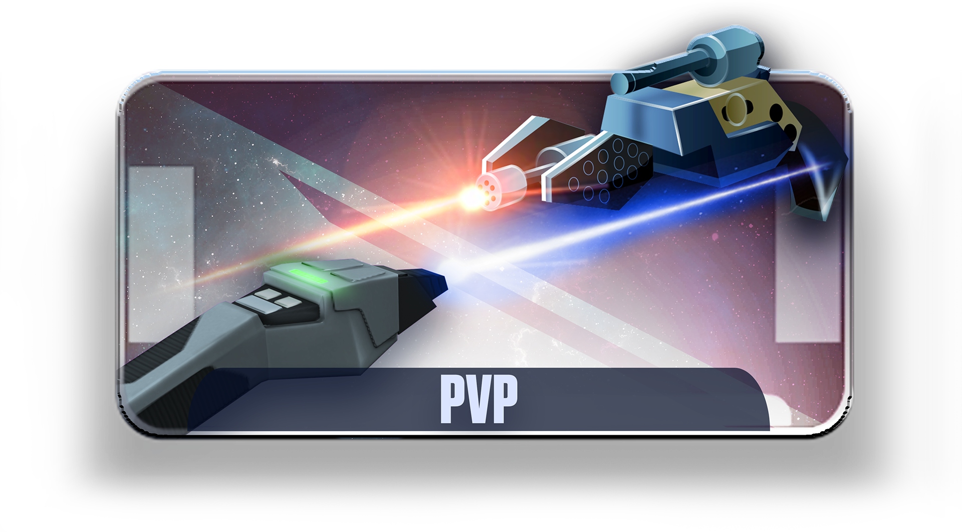
PVP Illustration Button
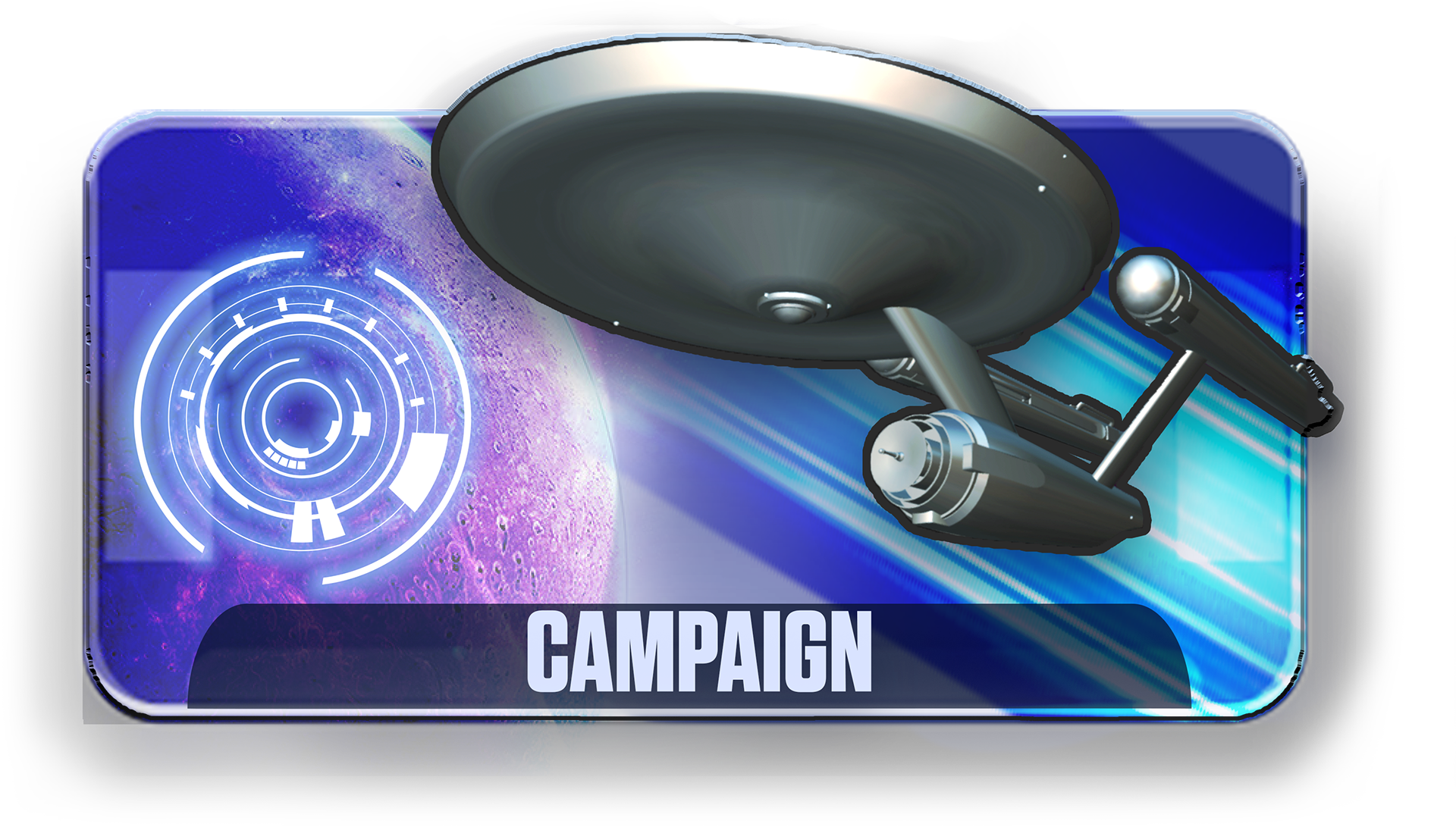
Campaign Illustration Button
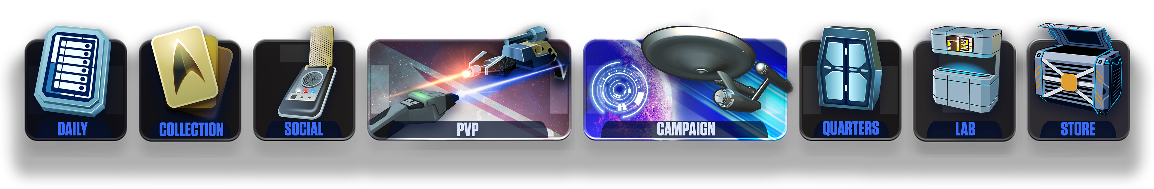
Bottom HUD Nav